
Project data limited due to NDA. For more info, please contact me.
Redesigning consumer carpooling app experience for 50K users.
MY ROLE
PLATFORM
TIMELINE
Product Designer + UX Researcher
iOS and Android app
1st stage: Jun 2025 - Aug 2025
2nd stage: Sep 2025 - Nov 2025
Introduction
TRIBBU is a mobility startup that connects people through a sustainable carpooling app, helping users share rides while reducing their environmental impact. With presence in Spain, Portugal, Colombia, and Mexico, TRIBBU empowers communities to move smarter and more efficiently through technology.
In this project, we revamped the user experience and redesigned the app’s UI, marking one of the most significant design initiatives at TRIBBU to date.
Problems
Since 2019, the user experience of TRIBBU (formerly Hoop Carpool) had remained unchanged, even as the company evolved. The most significant challenge emerged with a major business shift — moving from a B2B model to a B2C approach. Thanks to the energy-saving certificates issued by the Ministry for Ecological Transition, TRIBBU can now reward its drivers, enabling the platform to reach a much broader audience beyond corporate clients.
This transformation required a complete rethink of the product experience to make it accessible, engaging, and valuable for everyone. Below are the key problems identified within the core user experience:

PROBLEM #1
Misaligned Brand Identity
The overall brand image, tone of voice, and even the name Hoop Carpool no longer reflected TRIBBU’s purpose or values. The visual and verbal identity felt disconnected from the ideas of sustainability, trust, and community that define the brand.
EXAMPLE
Icons, colors, and typography lacked consistency, making each screen feel disconnected.
IMPACT
An inconsistent visual system misaligned with the brand’s values weakened trust and made the product feel like just another app.

PROBLEM #2
No Defined Journey
Users faced confusion when trying to complete their first trip, unsure whether to start as a driver or passenger. The trip creation flow was overly long and fragmented, making it difficult to set up routes efficiently.
EXAMPLE
Similar-looking screens made it unclear whether a trip was new, active, or pending, creating friction and uncertainty.
IMPACT
A lack of clear user journey increased drop-offs and prevented users from completing their first successful trip.
PROBLEM #3
Missed Growth Opportunities
Key features such as the Energetic BBonus —a strong conversion driver— and the referral program were underused across the experience. Their potential to boost engagement and viral growth was not fully leveraged.
EXAMPLE
The Energetic BBonus and referral incentives were hidden within secondary screens, with no clear communication of their benefits.
IMPACT
Low visibility of core incentives reduced user motivation, limiting both conversion and organic growth.

PROBLEM #4
Unclear Navigation
The app’s navigation was structured around features rather than TRIBBU’s core value proposition. Users were looking for more relevant actions, such as accessing their wallet, while chats and notifications were visually and functionally too similar, offering little distinct value.
EXAMPLE
The navigation bar felt generic and could belong to any app, and users couldn’t easily distinguish between messages and alerts.
IMPACT
Reduced usability and engagement, making it harder for users to access the most valuable features and information.
Defining the problem

Goals
BUSINESS GOALS
Transition from B2B to B2C
Shift the business model from serving companies to reaching individual users. This transition will allow us to expand TRIBBU’s impact, making sustainable mobility accessible to everyone.
Operational Efficiency
Build scalable design components to streamline development, ensure visual consistency, and improve collaboration across teams.
USER GOALS
Simplify and Enhance the Experience
Redesign the product to make it more intuitive, engaging, and aligned with users’ real mobility needs.
Deliver a Cohesive and Enjoyable Journey
Establish a unified design system that ensures a seamless, consistent, and delightful experience across all app interactions.
Our users
Before starting the redesign, we conducted qualitative research and interviews to understand our users’ real needs, motivations, and barriers. We focused on identifying what drives them to use a carpooling app — their daily routines, frustrations, and goals.
From this research, we defined three user archetypes and mapped their respective jobs-to-be-done.

The Routine Saver
A logistics operator who relies on his car to get to work, often sharing rides with colleagues to save fuel. He values punctuality, simplicity, and predictability in his daily routine.
JOBS-TO-BE-DONE
When I commute to work every morning, I want a reliable and easy way to share my car, so I can save on fuel and avoid last-minute surprises.

The Connected Student
A university student balancing classes, part-time work, and social life. Highly digital and social, she values affordability, safety, and intuitive experiences that fit her fast-paced routine.
JOBS-TO-BE-DONE
When I need to get to campus or work, I want an easy and safe way to share rides, so I can save money, meet people, and move sustainably.

The Efficient Commuter
A tech project manager working in a hybrid model. He seeks time-saving, stress-free solutions that integrate smoothly into his professional and personal life.
JOBS-TO-BE-DONE
When I go to the office, I want a convenient and flexible mobility option, so I can reduce stress, save time, and support sustainability.
Process
Rebranding & renaming
The first step in this new era was a complete rebranding and renaming — from Hoop Carpool to TRIBBU. In collaboration with Soluble Studio, we built an identity that reflects movement, connection, and purpose. The new brand embraces a bold, human tone and a visual system inspired by real shared journeys — from the warmth of the “BB pink” to a logo that looks forward. TRIBBU became more than a name; it became a symbol of community and everyday movement.
Design Sprints
We conducted design sprints to align teams and accelerate decision-making. Product designers, product managers, and marketing worked together to rethink the mobility experience from a user-centered perspective.
The goal of these sprints was to unify efforts toward a single objective — to create a simpler, more intuitive, and engaging experience for people moving every day.

App Audit — iOS & Android
We audited the app on both iOS (left) and Android (right) to compare usability and consistency across platforms. By analyzing every key flow, we identified major UX gaps and opportunities for improvement.
The audit revealed unclear value communication, confusing trip states, and long, fragmented flows. We also found missed opportunities to highlight the Bbono incentive and referral programs, and to clarify data usage during onboarding.

User Flows
We analyzed how different user types — B2B and B2C — interact with the app and move through each stage of the journey. From onboarding to post-commute, we mapped key touchpoints, segmentation moments, and behaviors to identify friction and opportunities for improvement.
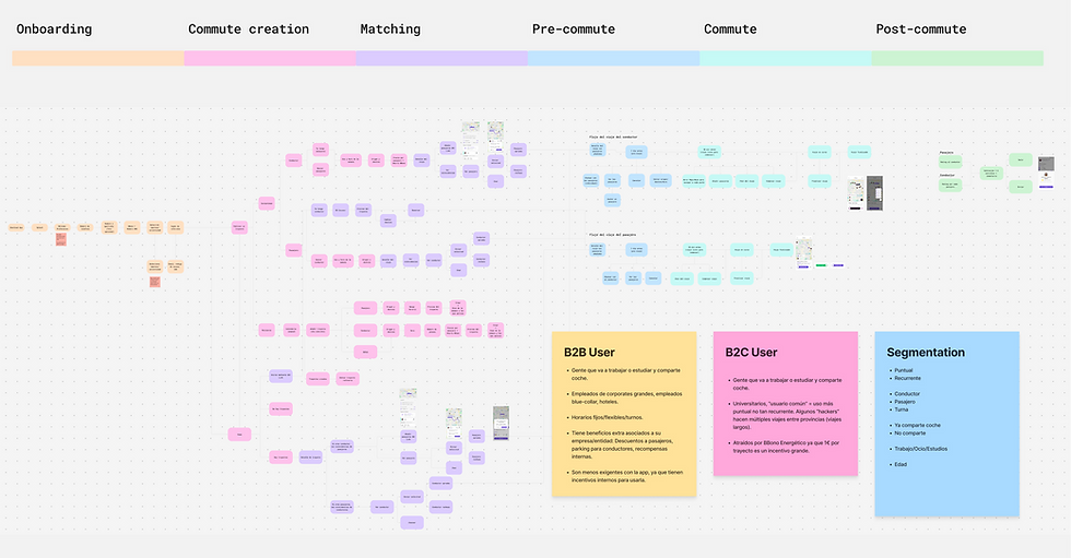
Then I led an ideation session exploring navigation patterns and commute creation flows.

Early Designs
We released an initial version of the app by adapting existing components to the new brand identity, without creating a full design system yet. The goal was to launch in September—right in time for the university season—so speed and consistency were key. These early designs focused on aligning visuals and structure while preparing the ground for a future scalable system.

Exploring Navigation Concepts
To evaluate different approaches for the new app structure, we designed three navigation explorations — each offering a distinct way to organize key actions and simplify the home experience.
These visual iterations allowed us to quickly compare options and align on how users should create, join, and manage their commutes.
1. Incremental
Reordered existing concepts: Plan and Wallet move to a new tab, while the Home (Travel) focuses on joining or creating one-time trips.

2. Dichotomy
Introduces two main tabs: Travel (to create or join commutes) and Search (to explore available routes). Plan and Wallet are added to the bottom bar.

3. Full Bar
Transforms the Home (Travel) into a space to browse published commutes, oriented mainly to passengers, while keeping a clear entry point for drivers to create new trips. Plan and Wallet remain accessible from the bottom bar.
We went through 100+ iterations
These navigation explorations went through countless rounds of feedback, user testing, and discussions with product, operations, and marketing to ensure the new structure felt intuitive, scalable, and aligned with real user needs.
I wish I could show you every single iteration!
Usability Testing & Customer Interviews
To validate our concepts, we ran moderated remote interviews with recruited users and did in-person guerrilla testing at a local university. We tested with both B2B and B2C users using low- and high-fidelity prototypes. The sessions helped us evaluate navigation, commute creation, onboarding clarity, and how the new brand was perceived.
We ultimately chose the Incremental approach because users understood it faster, felt more oriented, and moved through the core actions with less friction.

Final designs
Here’s a detailed walkthrough of the redesigned experience and how each improvement comes together in the final app.
New Look. Clear Purpose.
Before the redesign, the app felt cluttered and disconnected from what TRIBBU actually offered. The core value—sharing commutes easily and saving money—wasn’t clear. With the new experience, the interface becomes more focused, intuitive, and aligned with our updated brand.
We introduced scalable components, clarified key actions, and refined interactions to help users understand, trust, and engage with the product from the very first moment.

Introducing the TRIBBU Design System
We built a new design system from the ground up to bring consistency, clarity, and scalability to the product. The previous interface relied on inconsistent elements, which made the experience feel fragmented and harder to maintain.
The TRIBBU Design System includes fully defined typography, spacing rules, color foundations, and a new component library. For iconography, we adopted Anron Icons, allowing us to maintain a clean, cohesive visual language across the app.
This system now supports every screen of the product, ensuring a unified and robust UI that can grow over time. And, like any living system, it will continue to evolve as the product and its needs expand.

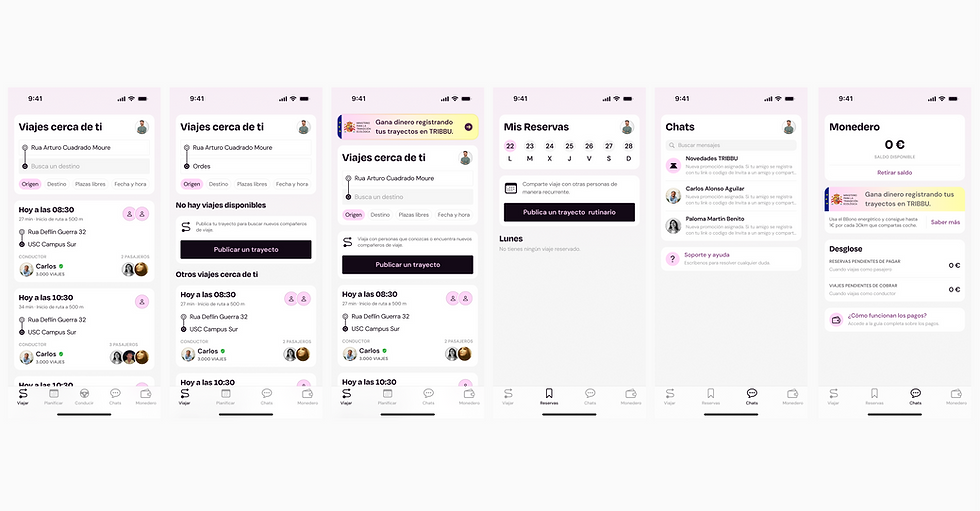
From Home to Commute
The screen now focuses on Travel, providing a clear weekly overview and highlighting main actions. The redesigned UI improves hierarchy and copy, while the new menu enables easier, more intuitive navigation and encourages users to create and join commutes.

Promotions, Chats & Notifications
We reorganized this section to make it more relevant and intuitive for users. By combining Promotions, Chats, and Notifications, we clarified content, improved discoverability, and made key interactions — like support and unread messages — easier to access.

Weekly Commute Overview
We redesigned this section to simplify access and improve clarity. By organizing content by weekdays, streamlining information on cards, and adding direct navigation from the bottom bar, users can now see and manage their weekly commutes more efficiently and complete key actions faster.

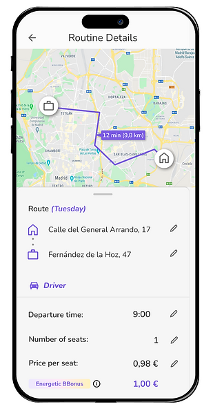
Streamlined Trip Creation
We redesigned the trip creation flow to reduce friction and increase conversions. By consolidating all steps into a single screen and adapting content based on the user’s role, users can review and modify every detail at a glance, while seeing their potential earnings to make decisions faster and more confidently.

A Smarter, Simpler Wallet
The wallet experience is now clearer, faster to access, and aligned with what users value most. Key balances take center stage, information is neatly structured, and placing the wallet in the bottom navigation turns it into a true financial hub—easy to reach and easy to understand.

Learnings
Design for real behavior, not assumptions
Throughout the project, we had to stay anchored in how people actually commute, not how we imagined they would. User interviews—both remote and on-campus—revealed confusion around key flows like trip creation, role switching (driver vs. passenger), and navigation. Prioritizing these insights kept the product grounded in real habits and pain points.
A product is only as strong as the teams behind it
Revamping the core experience of Tribbu meant rethinking far more than UI. Operations, growth, engineering, and data all had to adjust their processes—how trips are tagged, how incentives like BBono are surfaced, how communications are triggered, and even how we structure our internal tools.
Without constant alignment, workshops, and negotiation, many design decisions would have collapsed when reaching production. Collaboration wasn’t a step—it was an ongoing backbone of the whole project.
Move fast, but in controlled phases
With a hard launch target (back-to-university in September), we had to break the redesign into digestible, shippable phases. Instead of reinventing everything immediately, we delivered an “incremental” version: new navigation, restructured home, simplified trip creation, and a fully refreshed visual language—without yet building a full design system.
This phased approach kept development realistic, lowered implementation risk, and let us validate improvements continuously rather than all at once.
Future
Progressive rollout
This full redesign hasn’t been released yet, which is why I can’t include performance metrics at this stage. Tribbu is currently running on the September iteration — a first, time-sensitive version aligned with the new brand.
Phased integration into the roadmap
In the coming months, the complete redesign will be introduced gradually into the product roadmap. Rolling it out in phases will help us ensure stability, smoother development, and controlled QA—especially across the most complex flows like onboarding and commute creation.
Optimisation after release
Once the new experience is live, we’ll shift into post-launch optimisation. Collecting real usage insights will allow us to validate assumptions, fine-tune navigation, strengthen value communication, and continuously improve the end-to-end commute journey.
Evolving the experience
As the redesign rolls out, the design system will mature, components will scale, and our UX principles will continue guiding improvements. This work lays the foundation for a more coherent, intuitive, and purpose-driven Tribbu.
This redesign has been one of my most meaningful contributions at Tribbu. It was only possible thanks to close collaboration with product, engineering, operations, and growth. The work continues — but the foundations are stronger than ever, and I’m excited to see how this next chapter will shape the future of daily mobility.